Incite
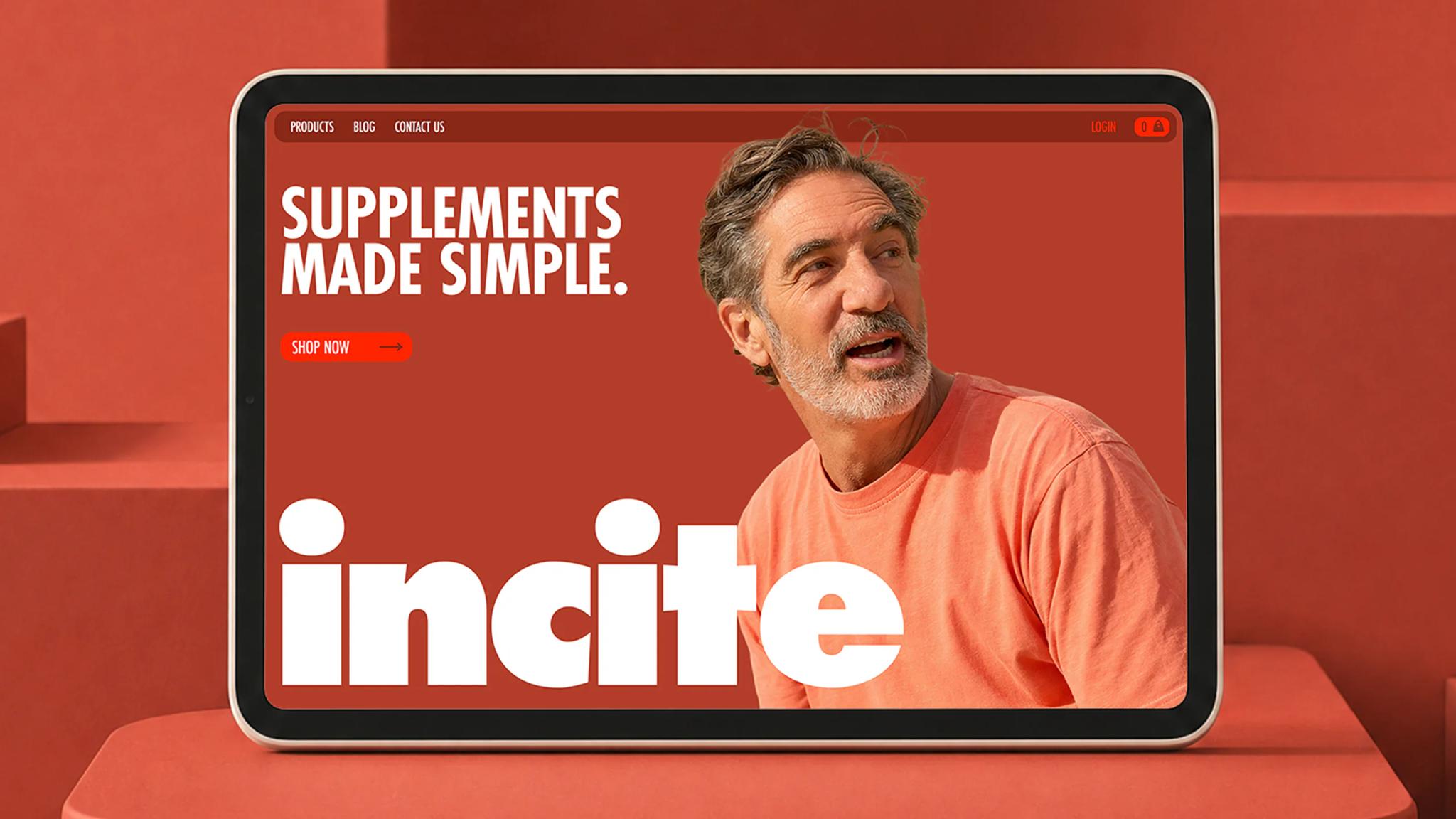
Supplements made simple
- Wellness
- Create
- 2025
Context
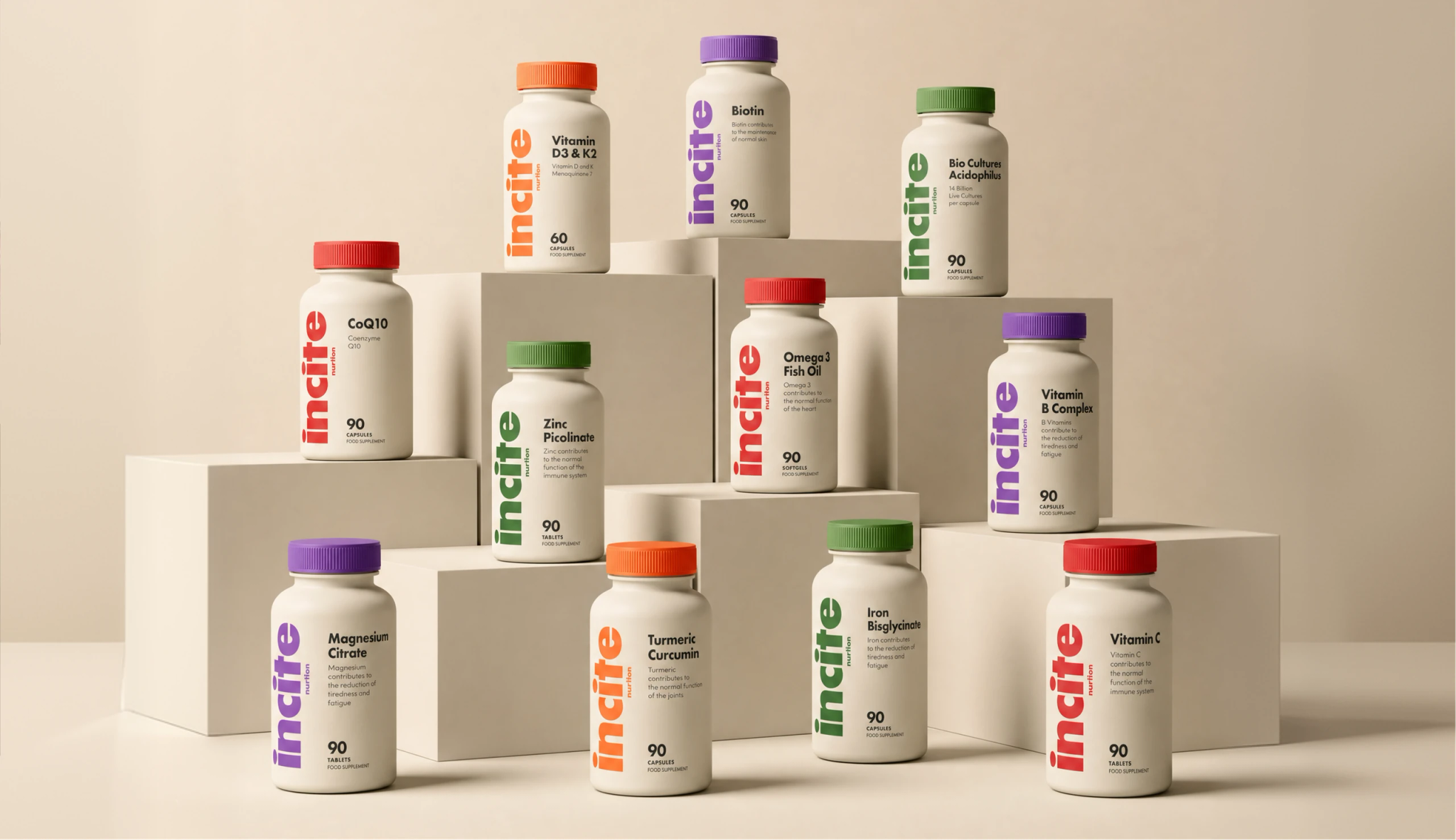
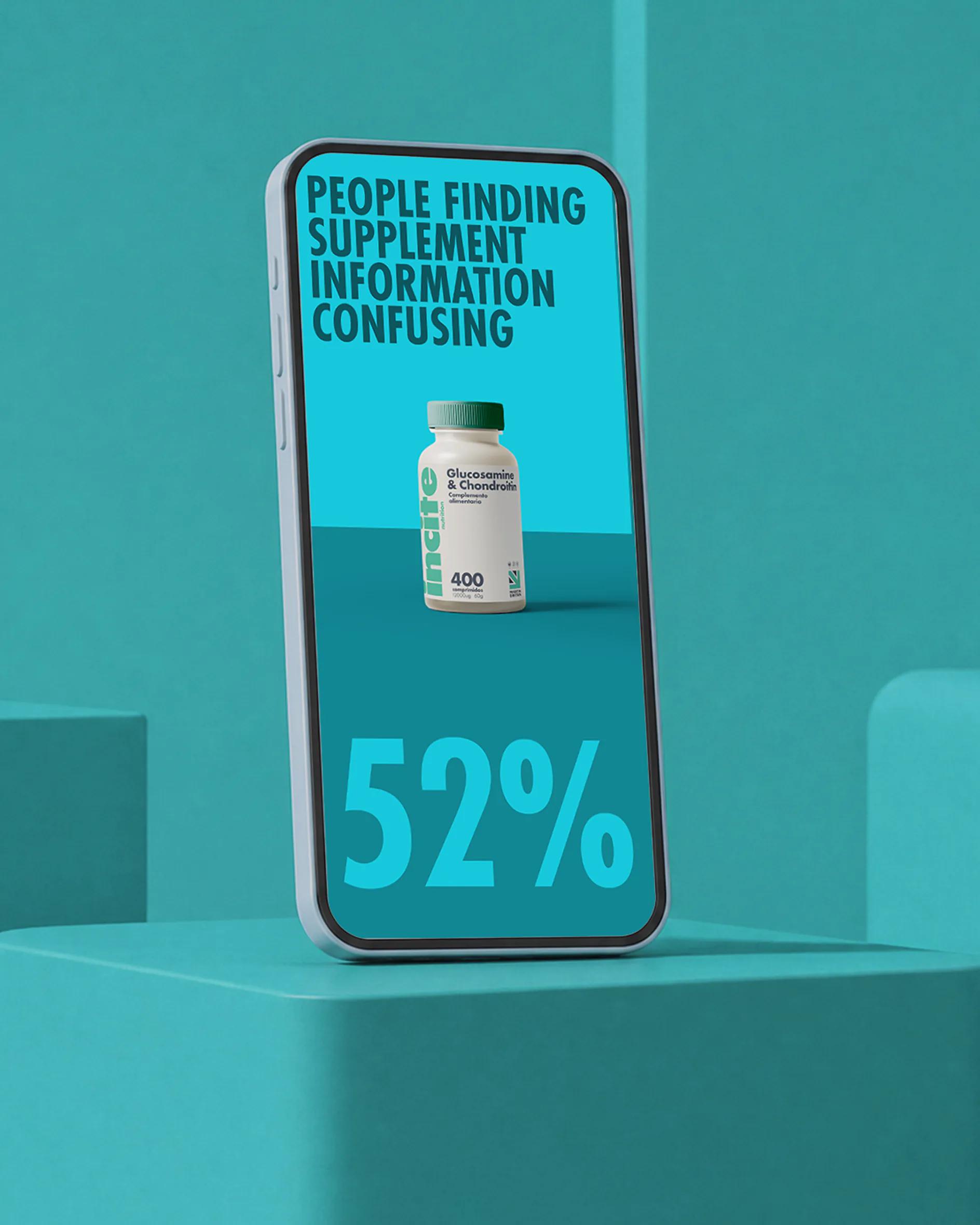
White bottles, blue accents, clinical sans-serifs, a stock photo of a smiling pharmacist. Incite had forty-plus SKUs across vitamins, minerals, sports, mood, and herbals — and the existing system made them indistinguishable from a Boots own-label. The brief was simple to say and hard to do: keep the science, lose the pharmacy. The customer was already active, already informed. The brand wasn't catching up to them.
Insight
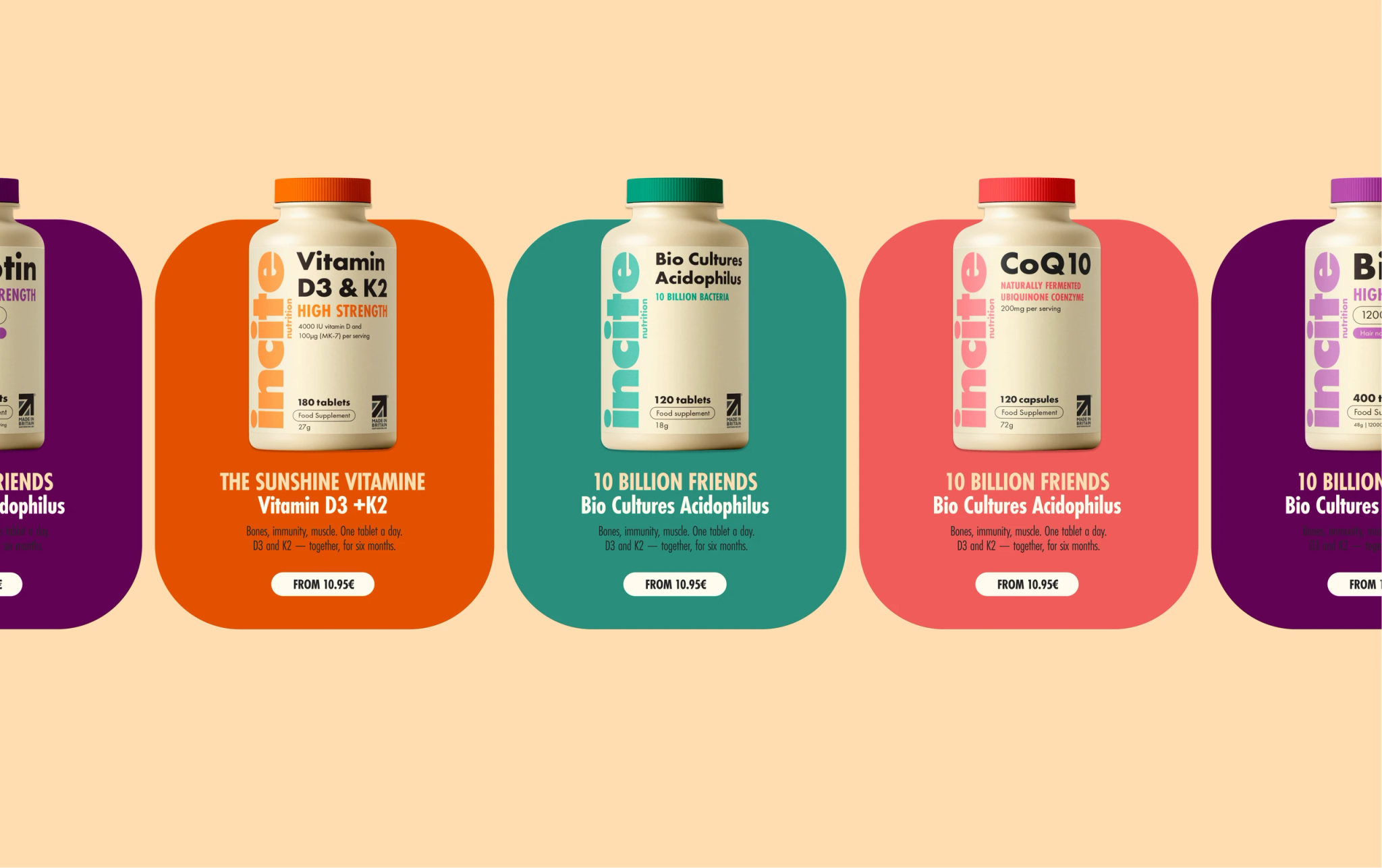
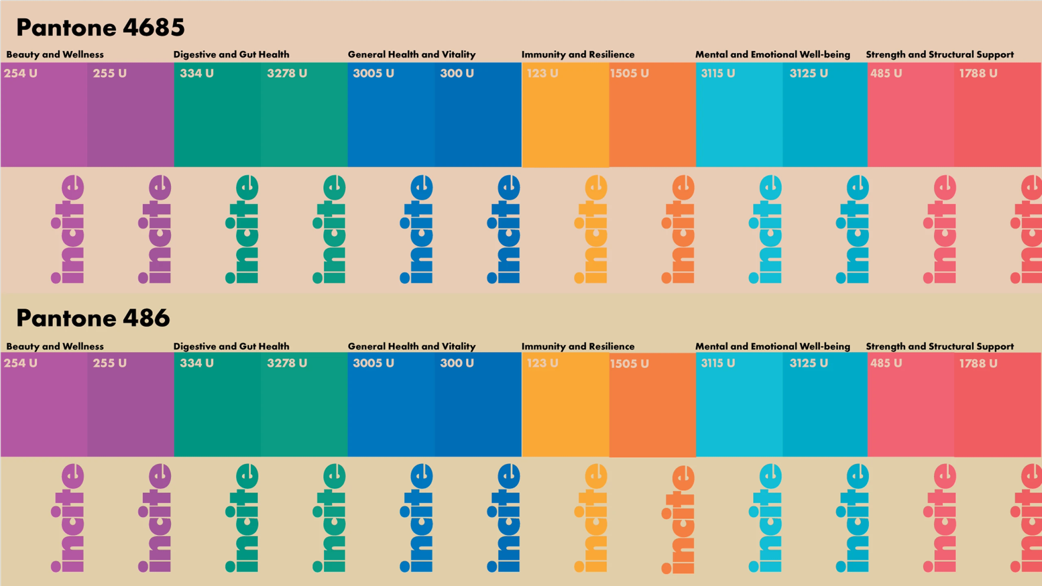
We treated the range as a wardrobe, not a pharmacy. One brand, many moods. The lever was colour, because colour is the one signal a pharmacy will never use confidently. Supplements made simple — Incite's own line — kept the promise of clarity. We just changed what clarity looked like. Sporty, not sterile. Made for the gym bag, not the medicine cabinet.

Idea
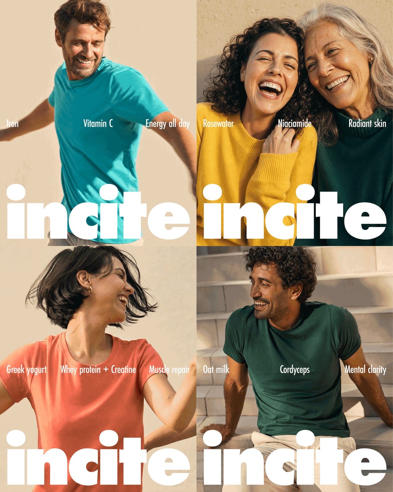
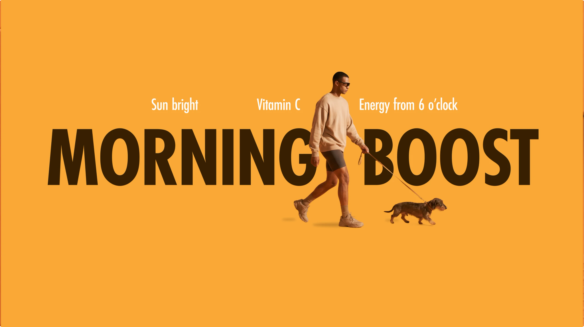
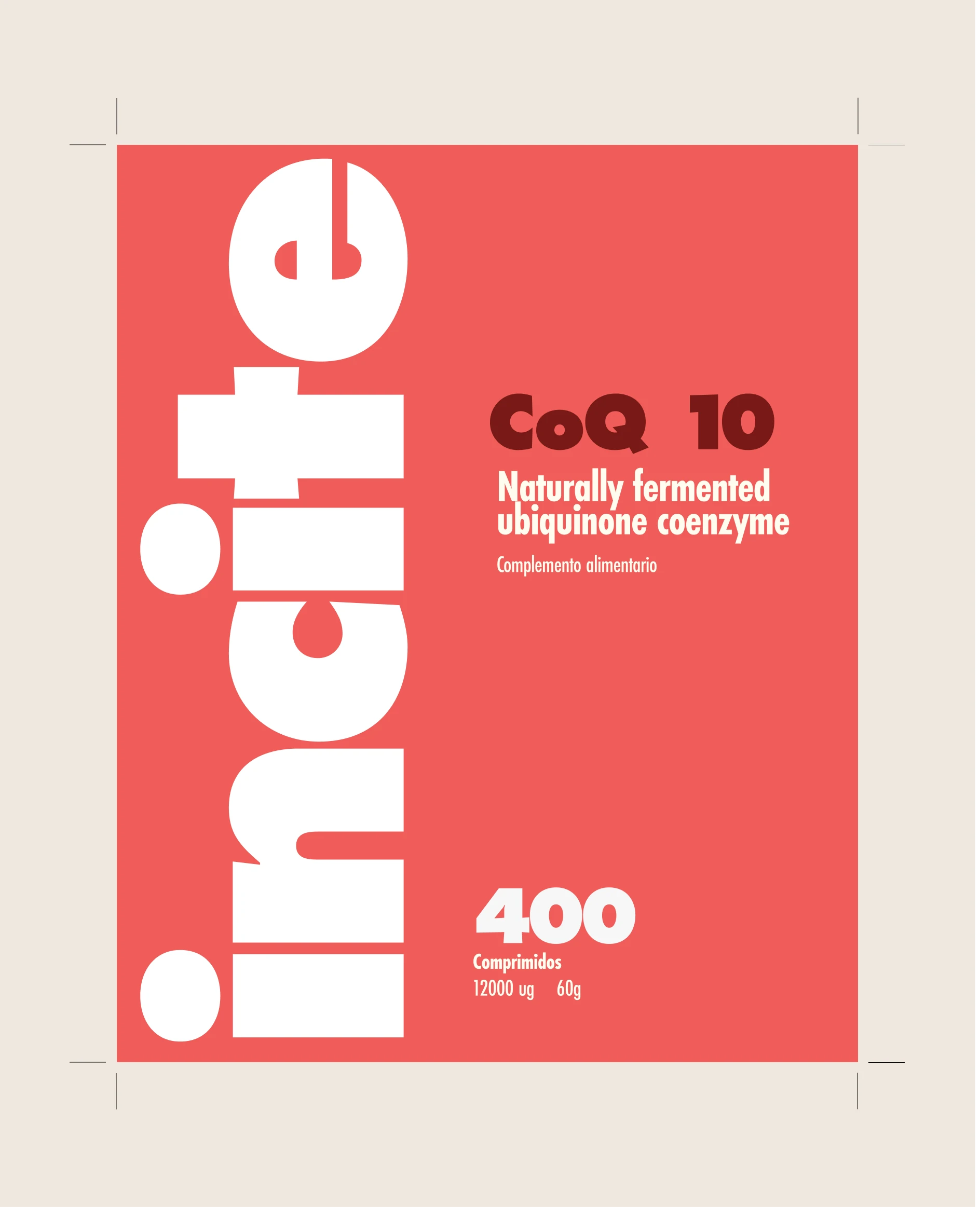
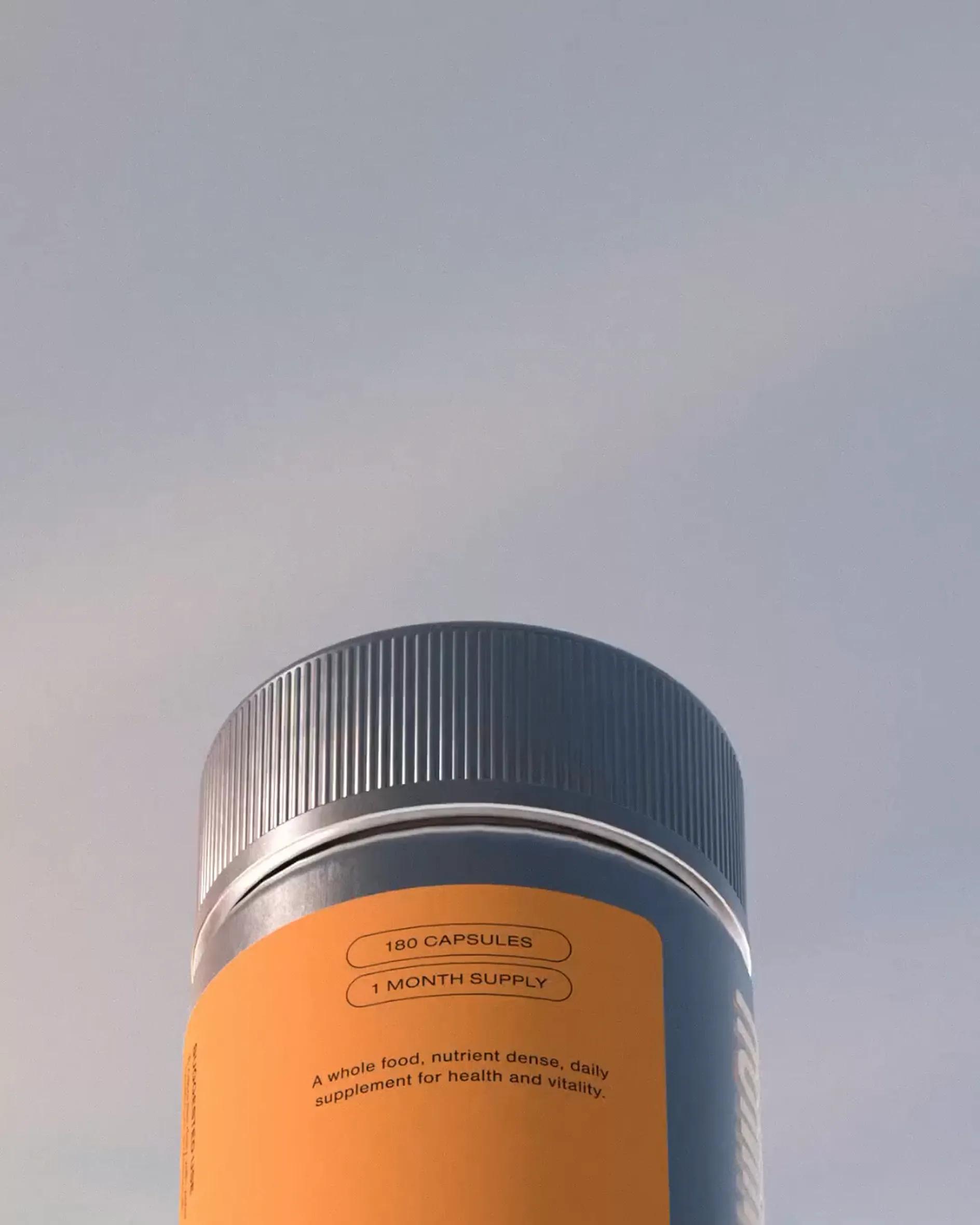
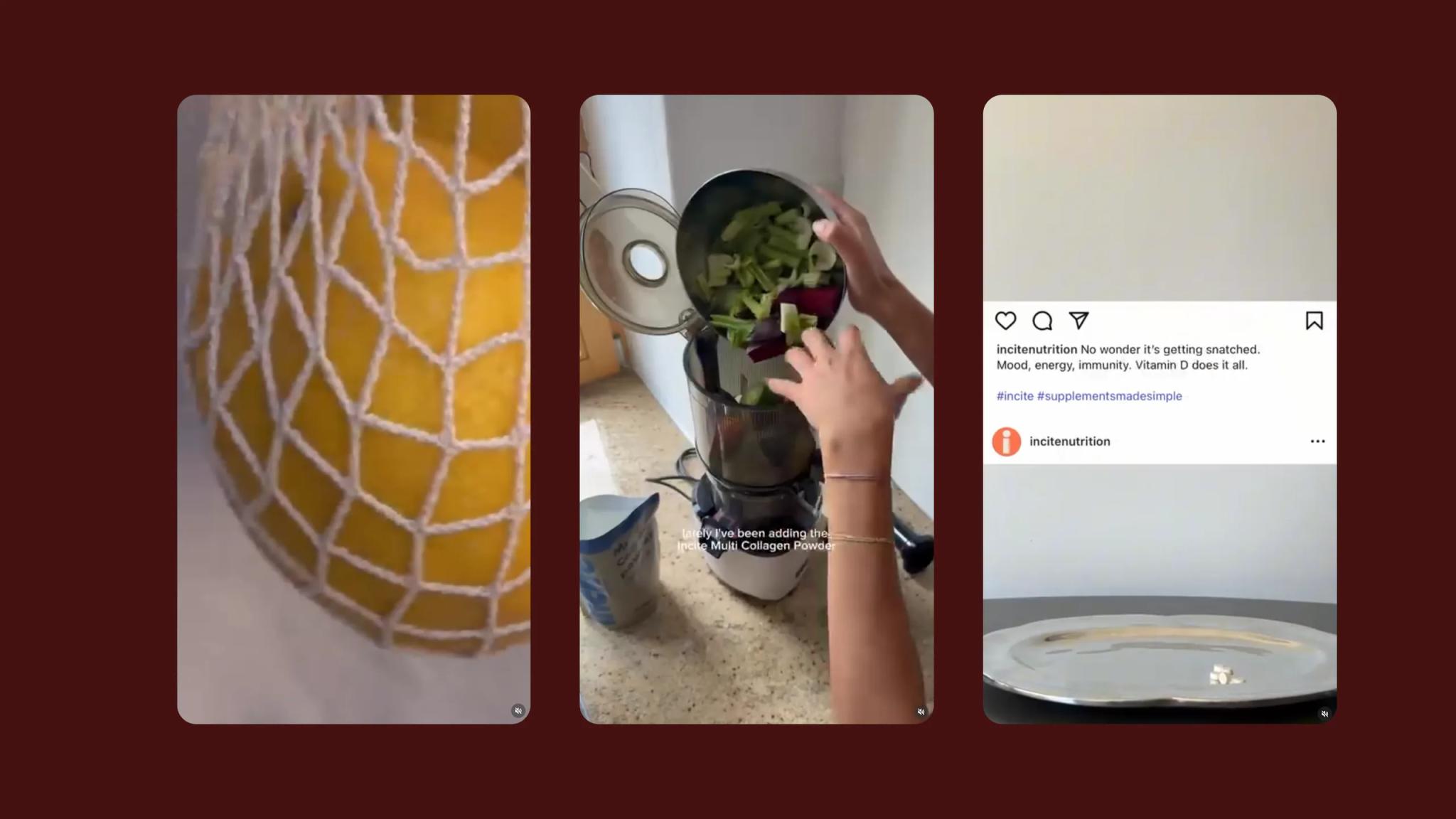
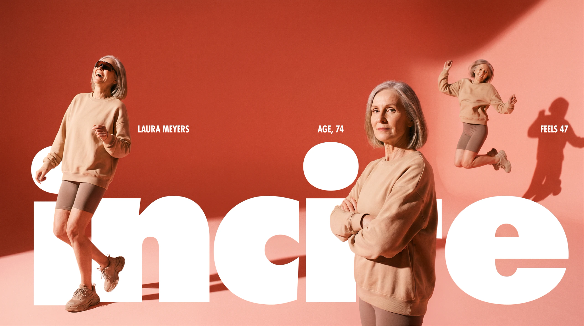
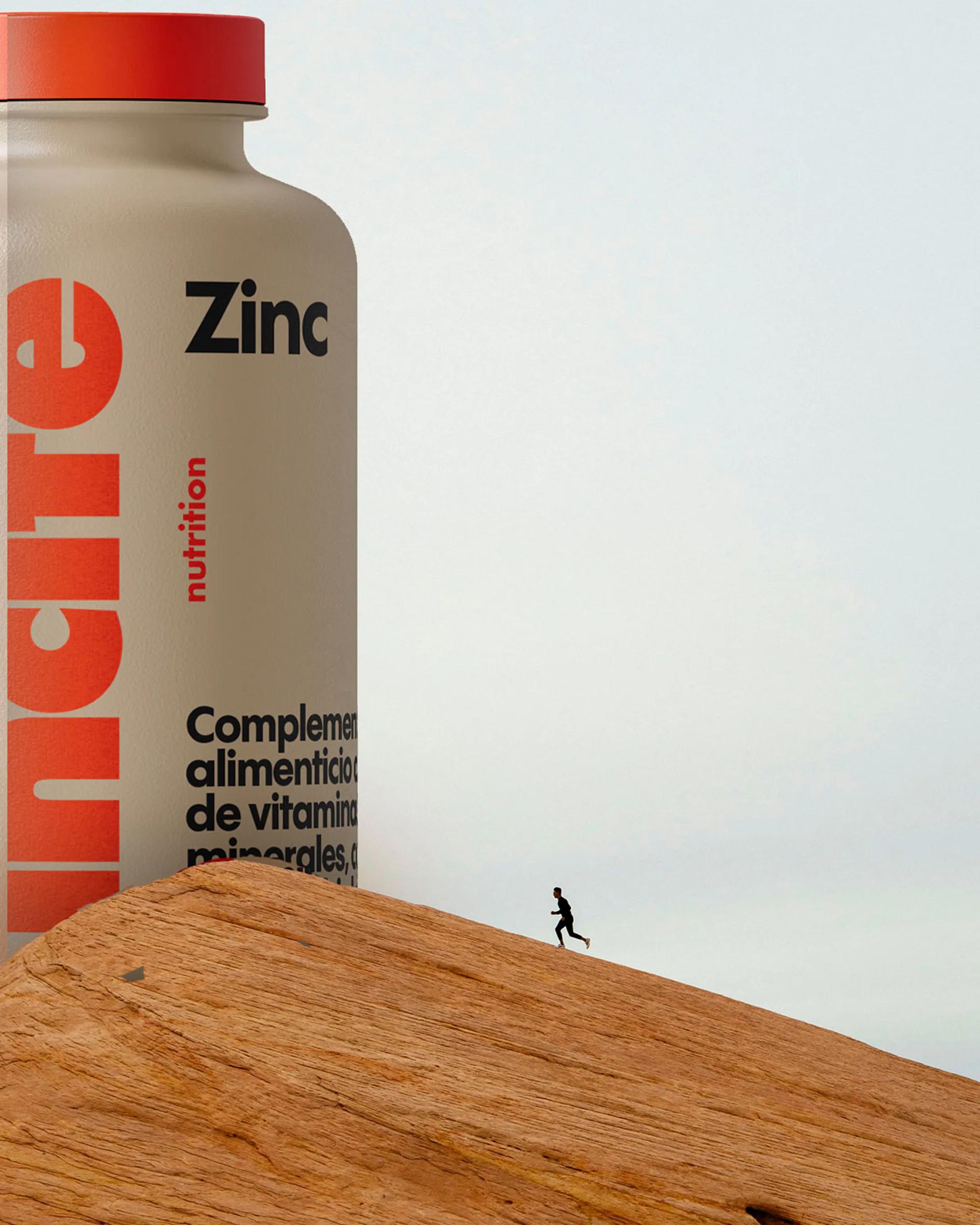
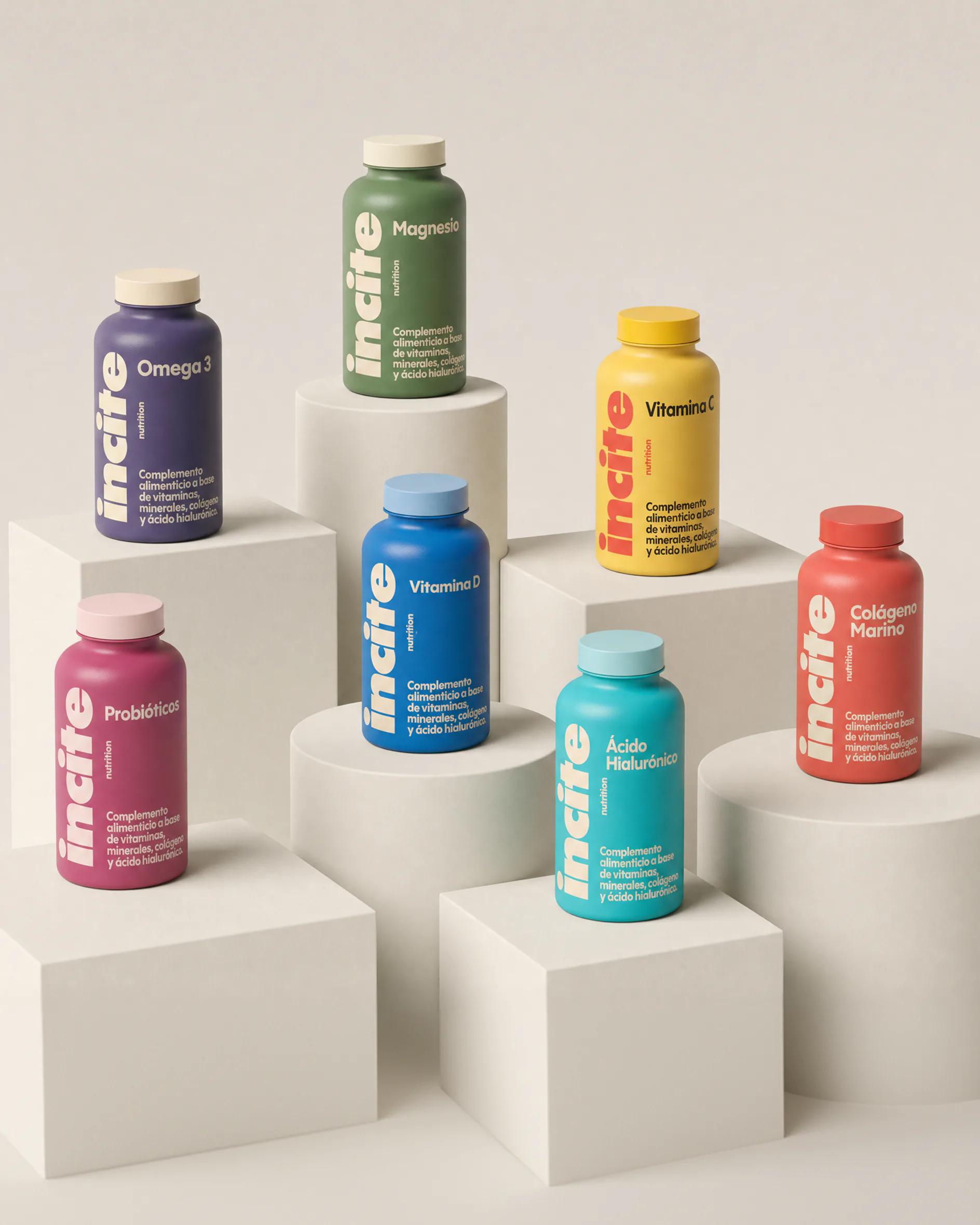
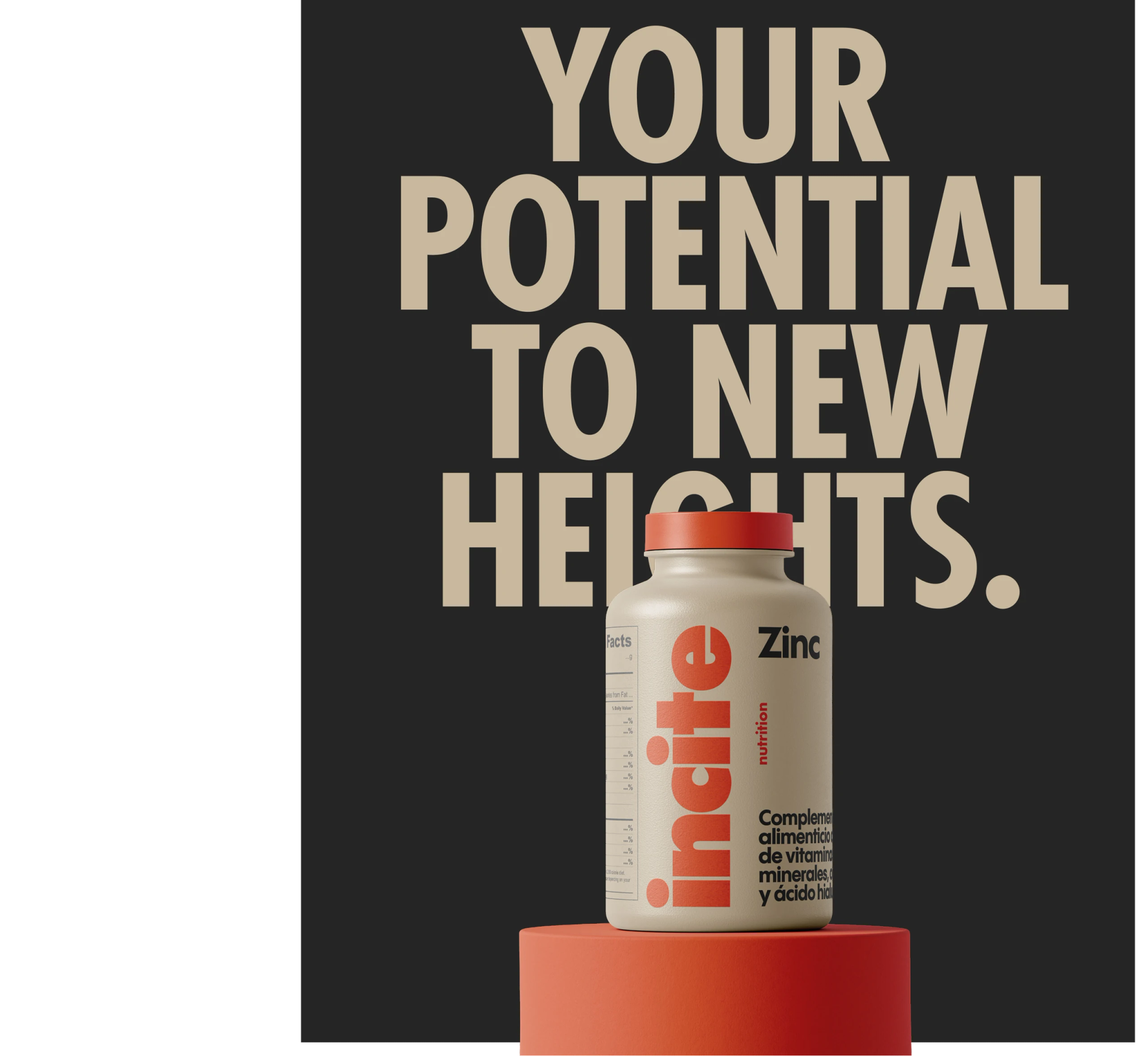
No clinical blue and no warning red. Sorbet pinks, court greens, citrus yellows. The chromatic register of sportswear and energy drinks, not of medicine. Typography sits between editorial and athletic: a clean grotesk for product names, weighted heavier than the category expects. Photography keeps product flat, lit hard, shot against its own colour. Every bottle reads as its own object. The range reads as one family by rhythm, not by uniform.
Application
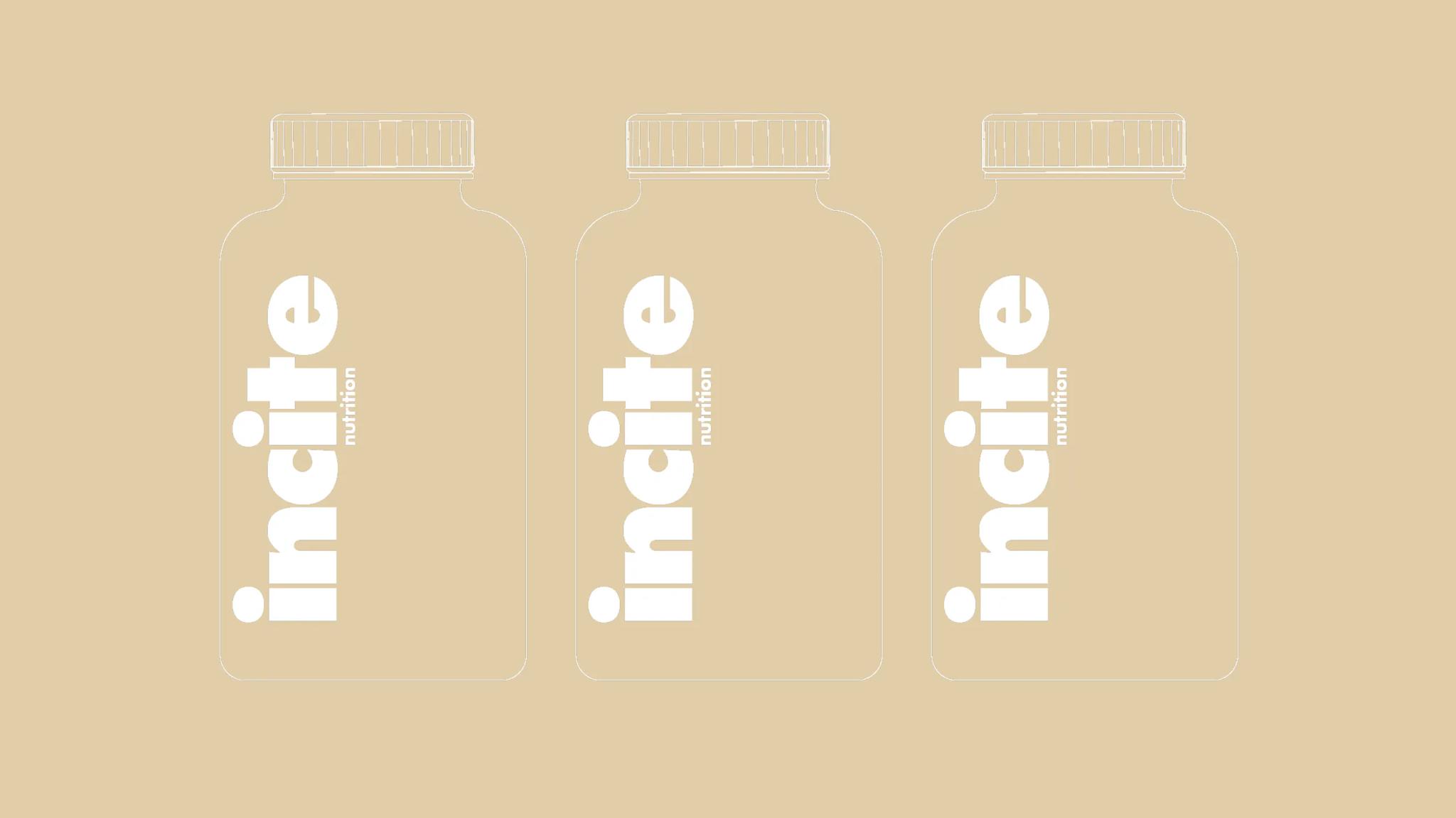
The system applies at every scale. A quiz-led navigation lets the customer enter by goal, not by ingredient. The smallest move is the label itself: name, dose, benefit, nothing else. No "advanced complex." No "premium formula." The white space on the bottle is the loudest thing in the category



Impact
Forty-plus SKUs unified under one system, sold direct across the UK and through Yaba's European network. The brand kept the trust of an active customer base — ultra-runners, weekly sport players, the people the supplement aisle wasn't built for — and gave them something worth being seen with.

Context
Insight
Idea
Application