Chocovic
Colour between flour
- Food
- Refresh
- 2025
Context
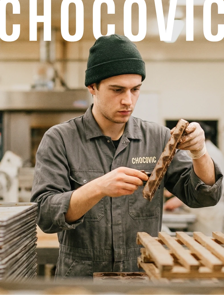
Europe consumes around 3.5 million croissants a day. Chocovic has supplied them for 150 years. Not the chocolate you photograph. The chocolate that gets baked at four in the morning, dropped into buns, melted into glazes. A working product in a category obsessed with looking premium. The brand had drifted there too — cleaner, glossier, further from the bench. The work was to bring it back to where the chocolate actually lives: in the hands of the baker, before sunrise.
Insight
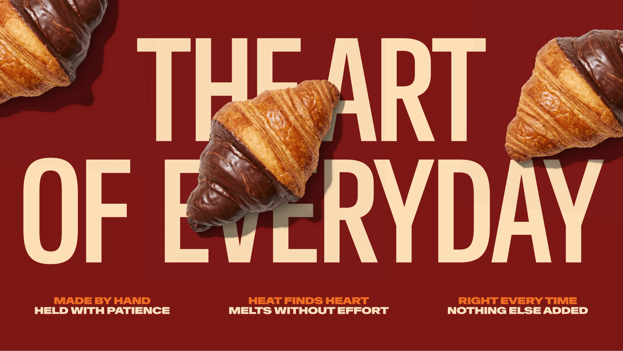
Chocolate at Heart was the strategic territory, defined by Hamlet. The design had to translate it. We took the idea somewhere else. Made to be used. Heart as the centre of the working chocolate. The thing in the middle of the croissant, the bun, the glaze. A utilitarian identity for a brand that exists to be opened, scooped, melted, baked. Not admired.

Idea
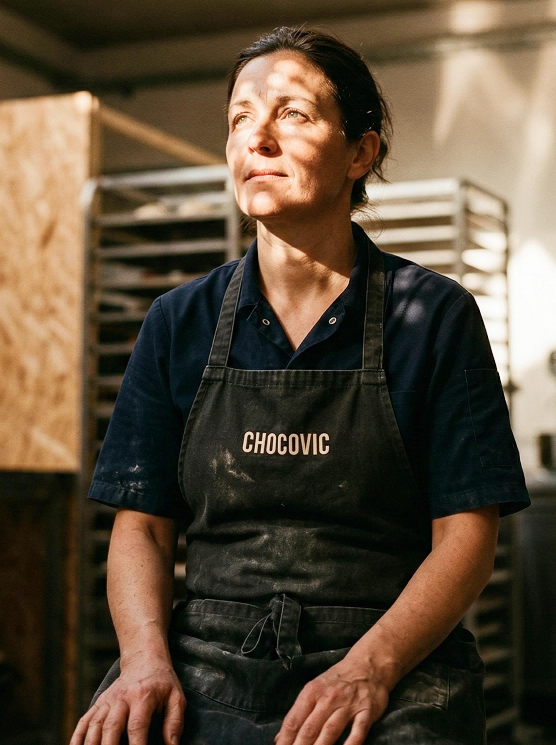
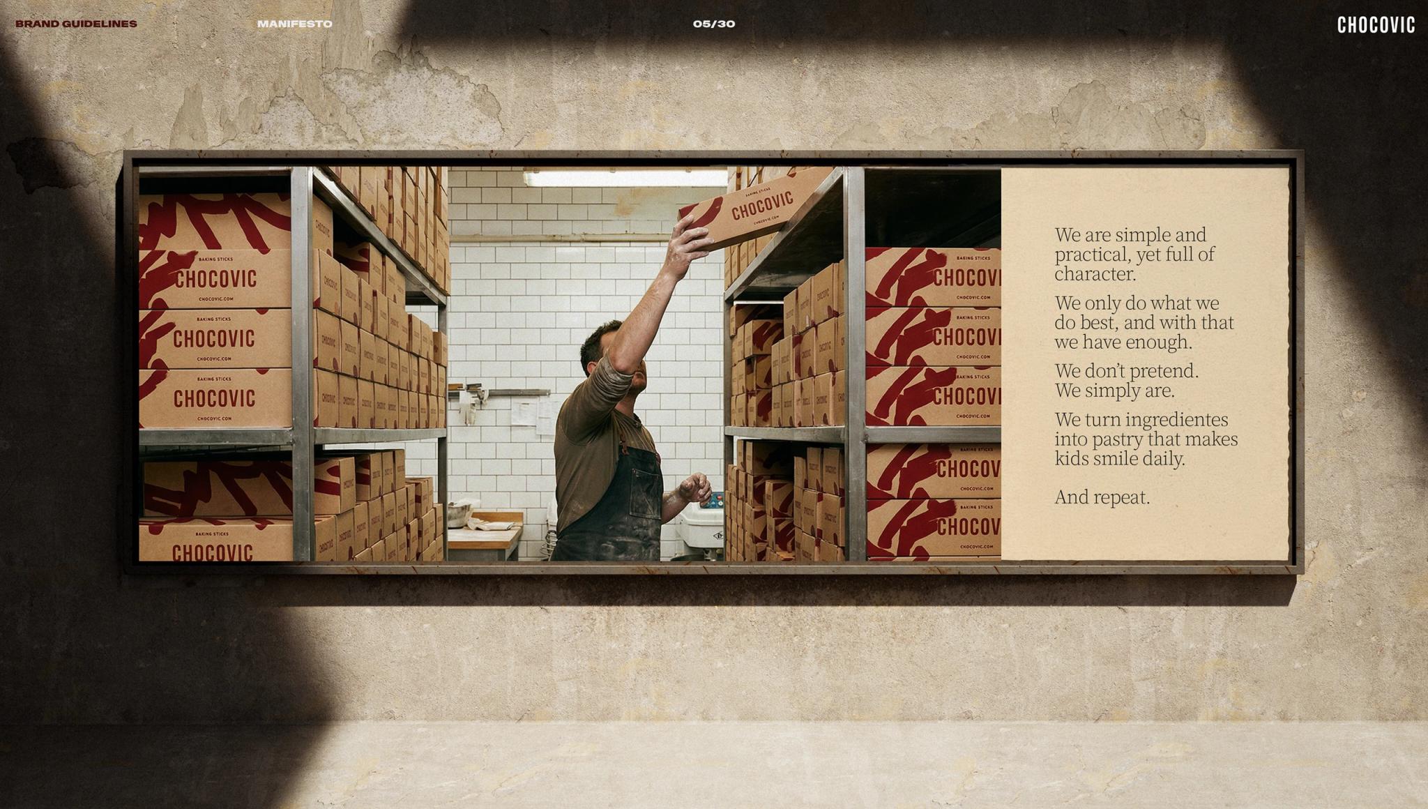
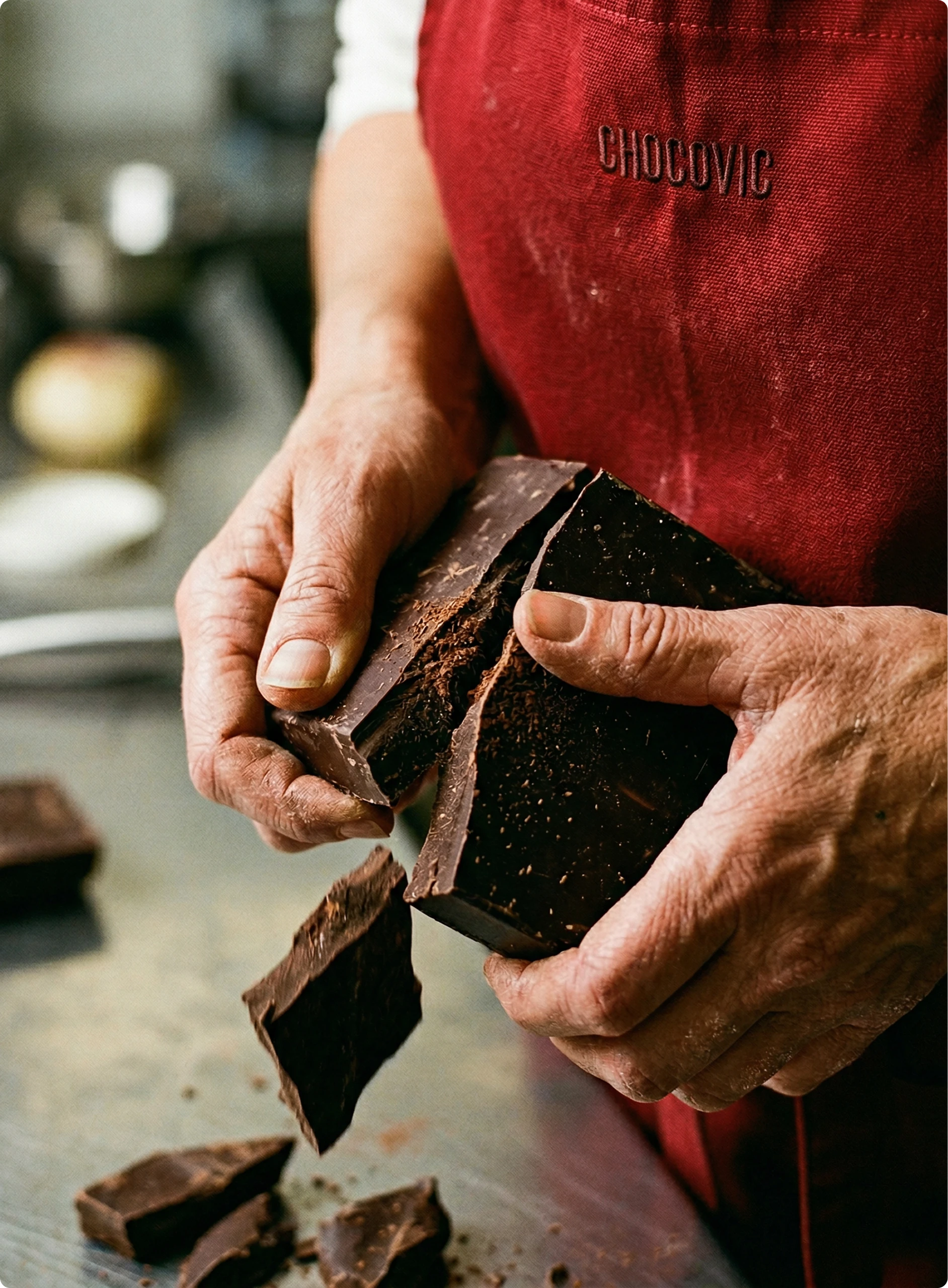
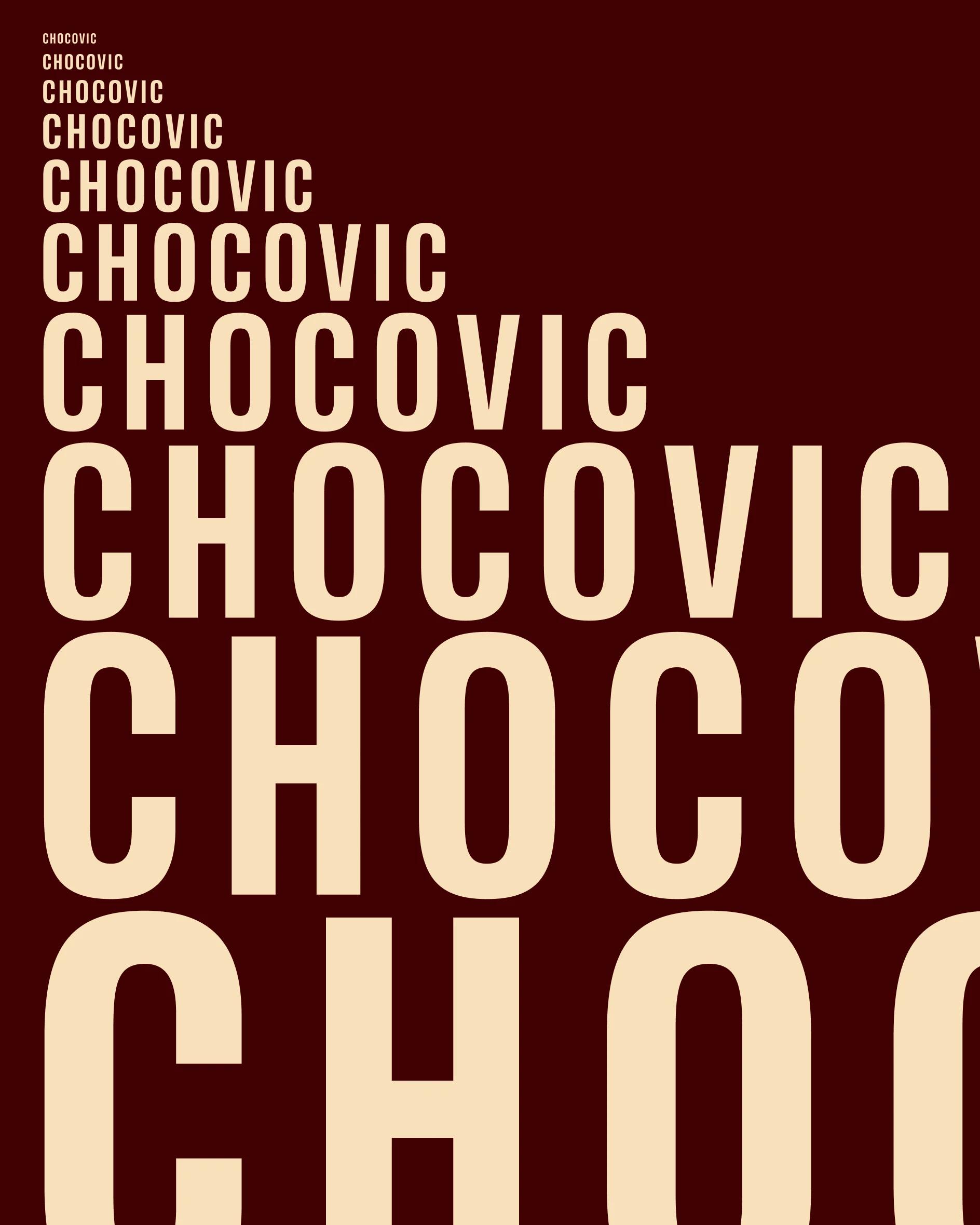
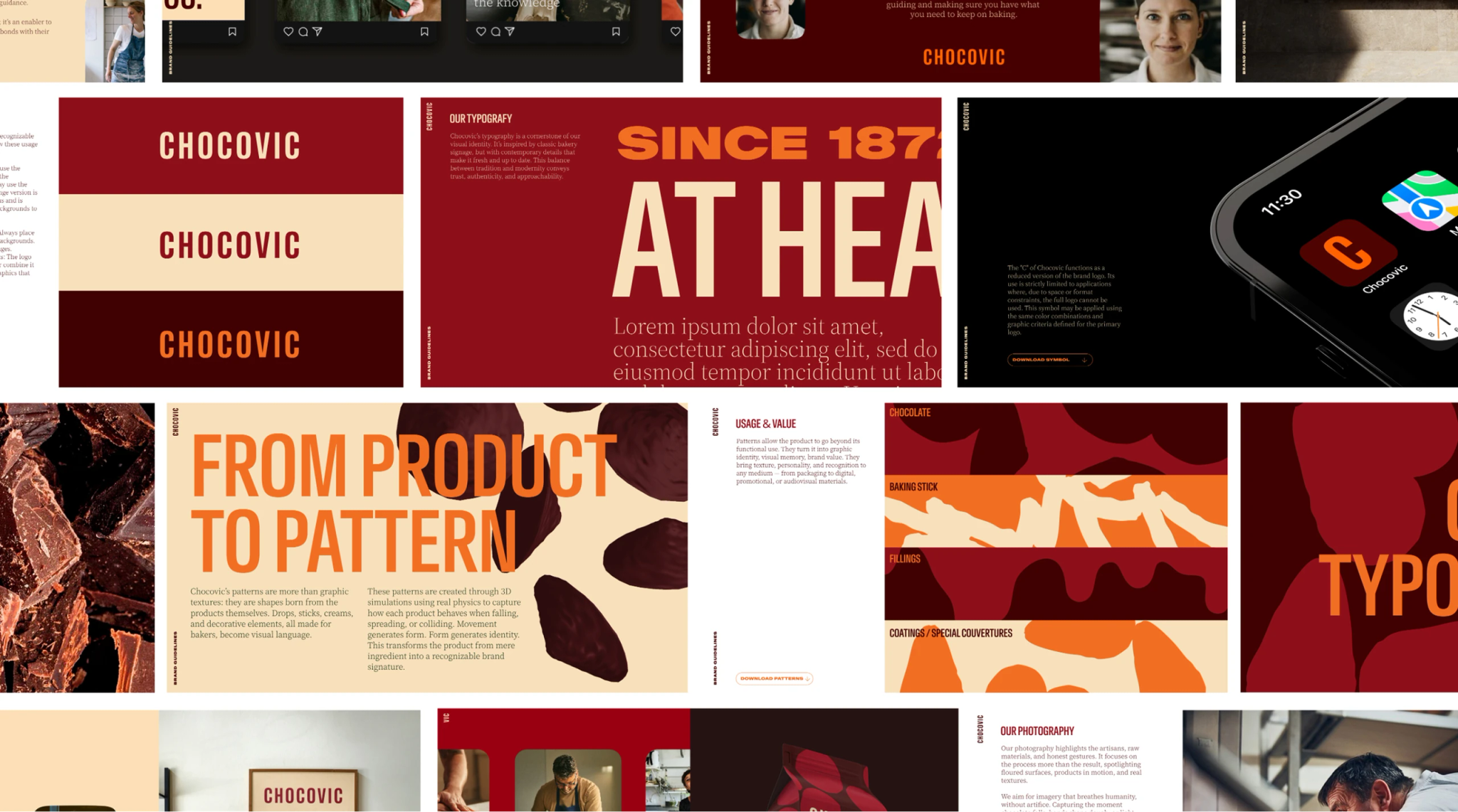
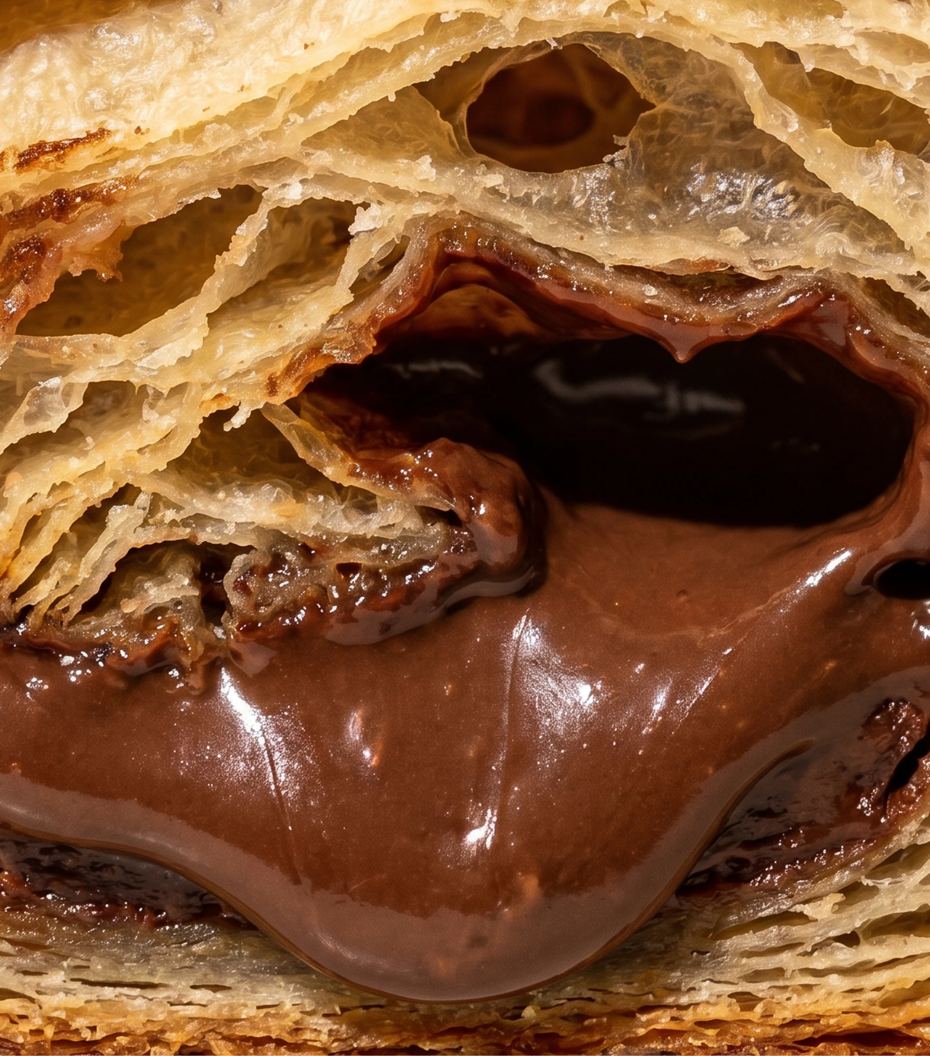
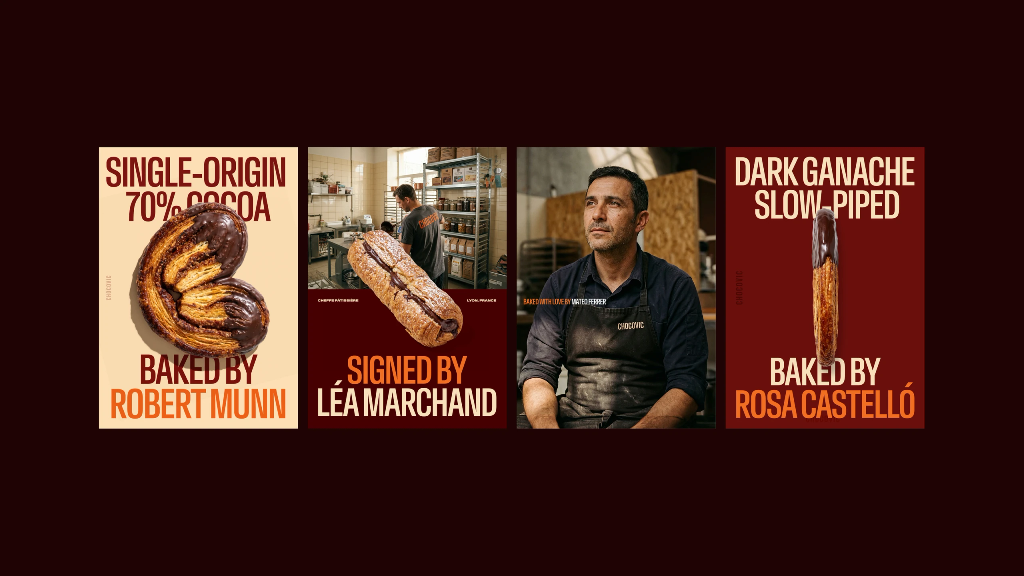
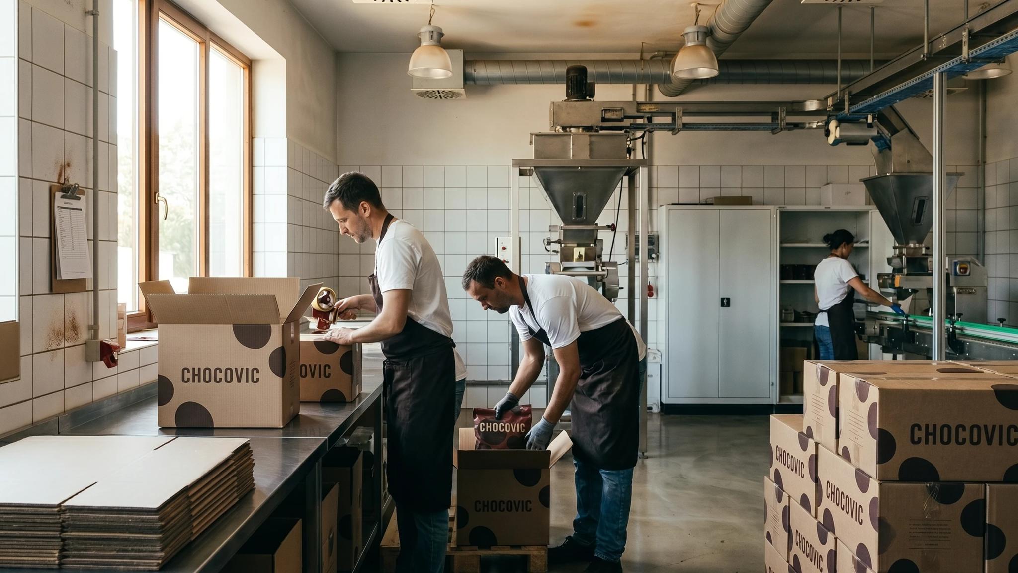
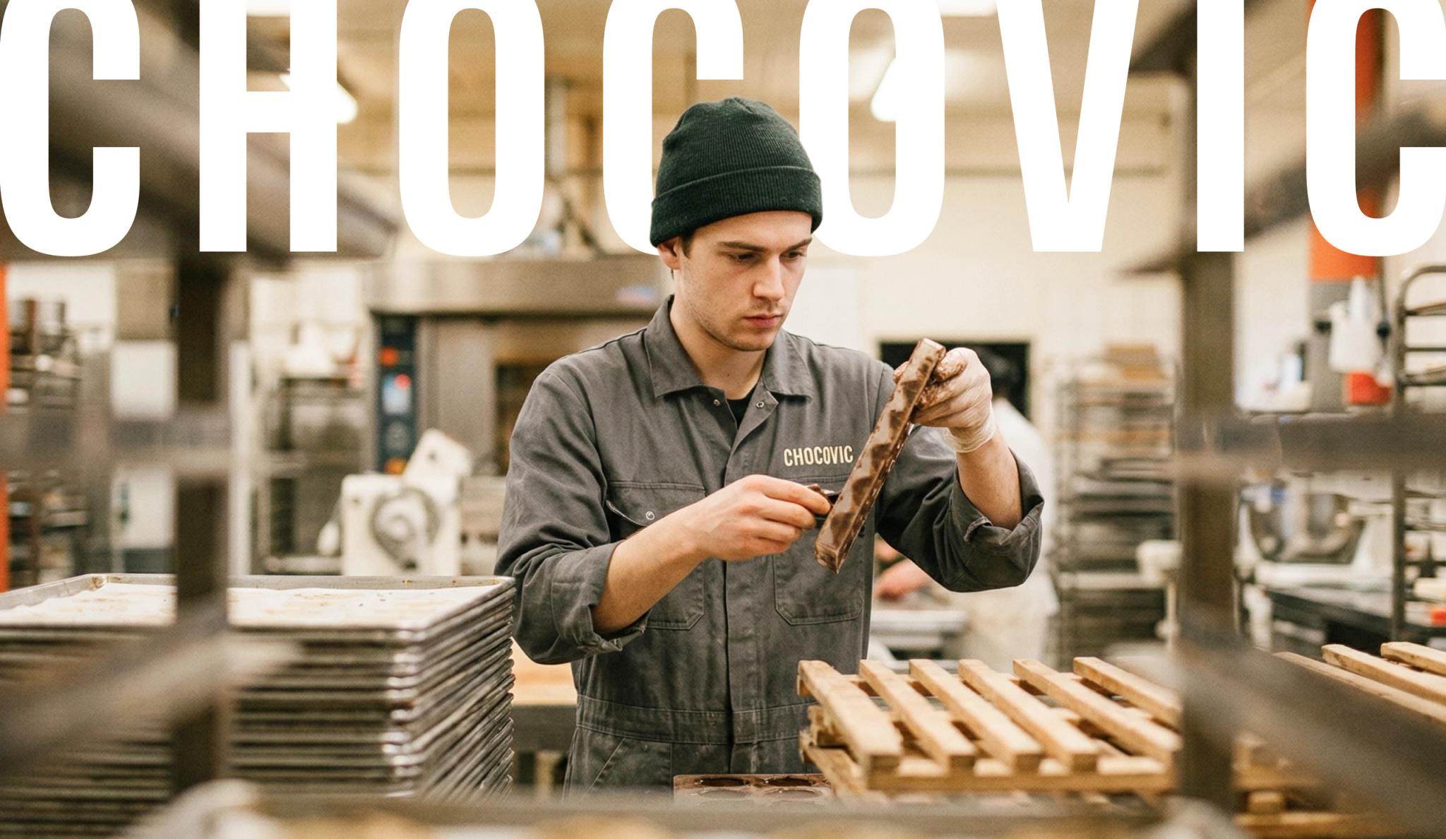
Made to be used. The system was built from inside the bakery, not outside it. We designed in VR building every element by hand. A utilitarian uppercase wordmark, a block of letters made to be read. Warm and wide, the palette stretches across every product and surface. Photography goes warm and dirty: real places, real hands, dough on the bench. The brand exists at arm's length from the chocolate. Always.
Application
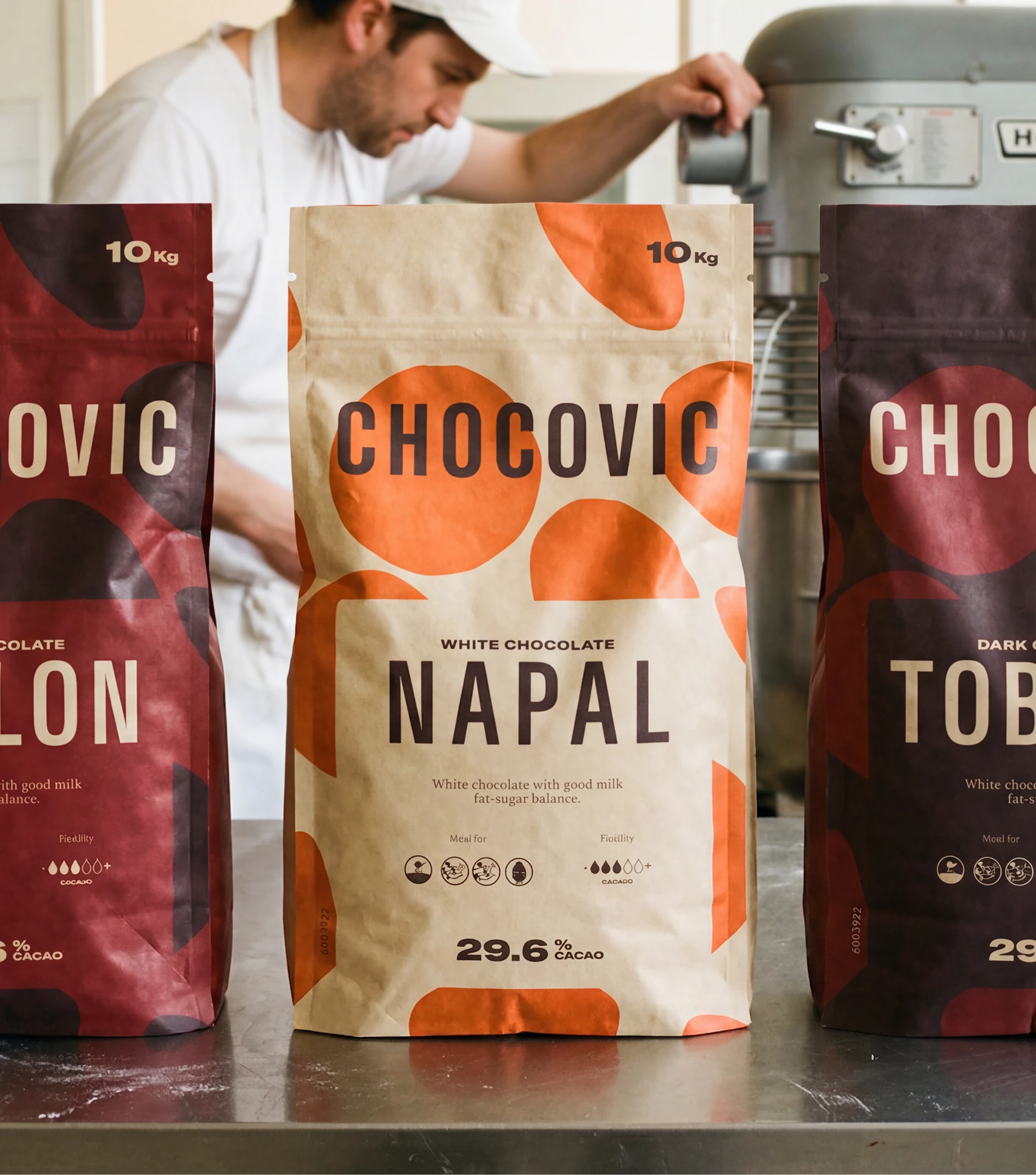
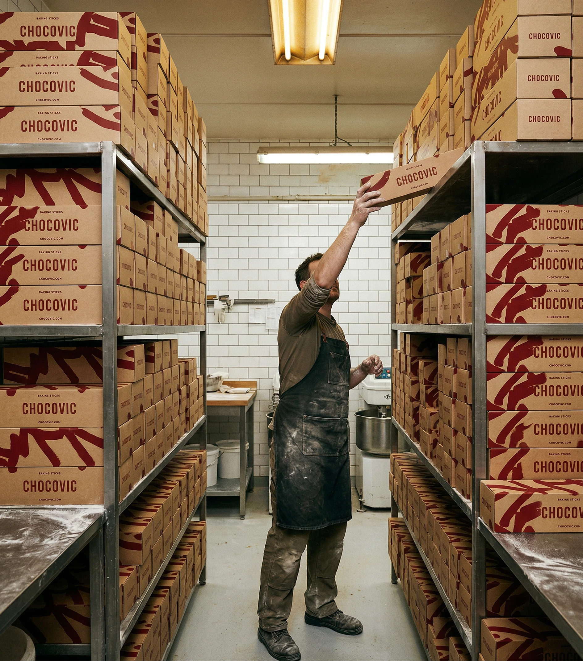
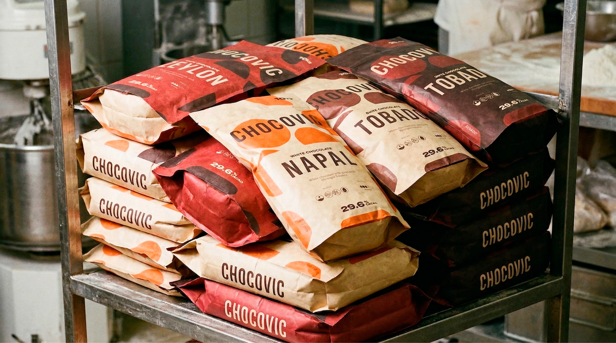
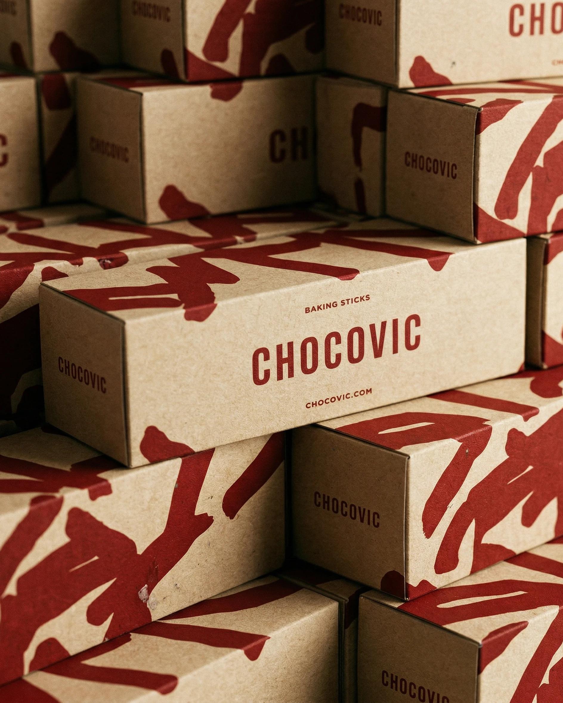
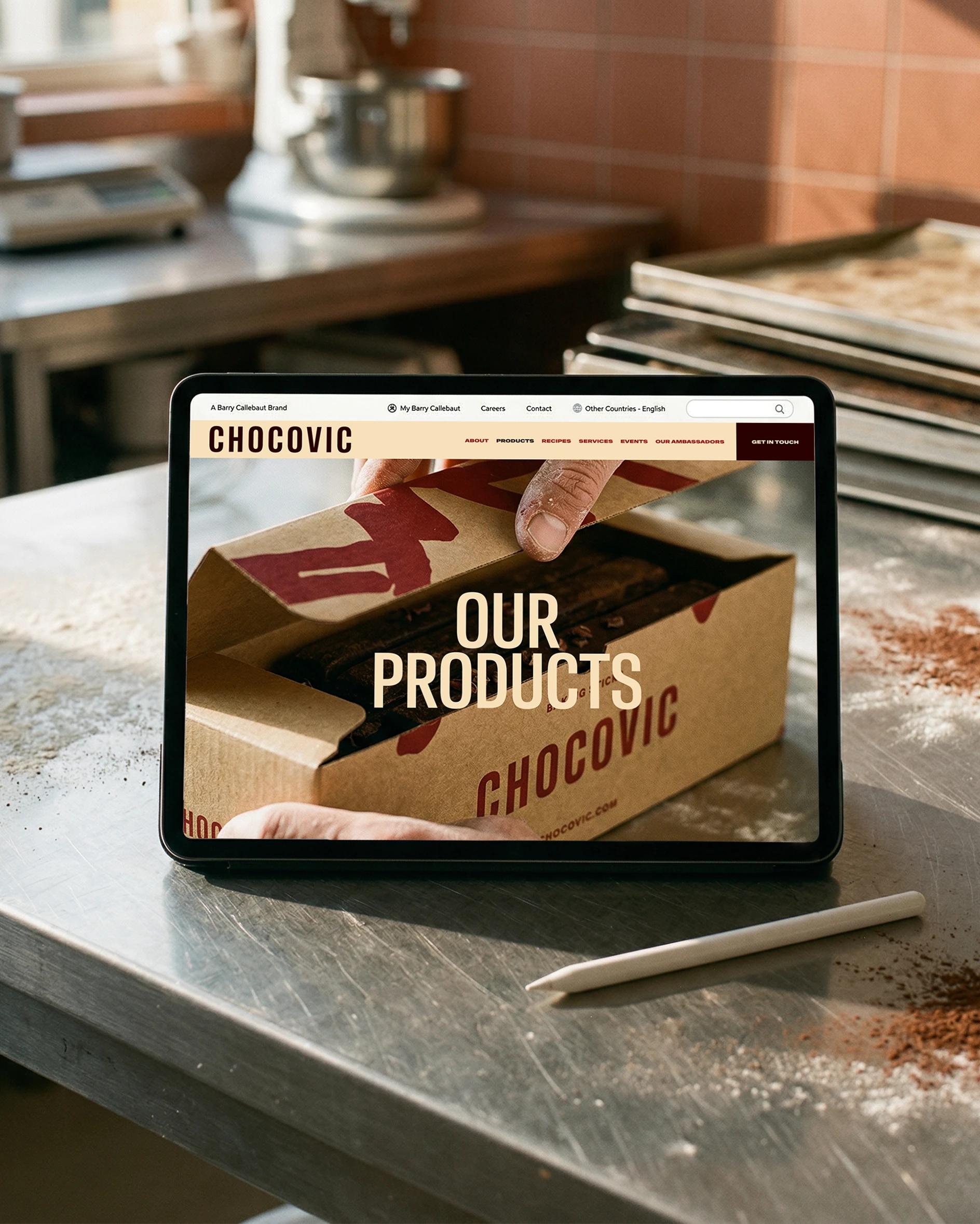
The system lives in the bakery, not on the screen. The packaging is built to be seen from across the room — large formats, high contrast, the 3D chocolate textures scaling up into colour blocks visible through flour and steam. The website carries the system online, but the bench is where the brand is read. From two metres away, before anyone has touched it.
Impact
Chocovic now speaks the language of the bakers it serves. The packaging is read from across the obrador. The system holds across every product family, every market, every surface, without thinning out.

Context
Insight
Idea
Application
Impact